
First direct - Case study
Big-picture view
of users finances
first direct bank aimed to provide its customers with enhanced visibility and control over their finances, including data-driven insights and tools like budget-setting.
To accommodate this, first direct planned to create a new section within the app which would serve as the go-to-place for all of the customers’ financial insights.
Defining the problem
Users lack an easy way to gain insights into their overall financial status, a capability that has become an expected feature.
The goal
To have a dedicated section within the app to surface personal financial insights.
Understanding our users
45% track manually
Almost half of our users track their finances manually using spreadsheet


Competitor Analysis
Data driven visual insights
During the discovery stage, we conducted extensive research our competitors. We aimed to understand how these apps present relevant, personalised information while also exploring how they create visually appealing and intuitive user experiences.


Early ideation
Clear, simple,
and informative
Using key data points, we aimed to provide users with a quick overview of their spending habits. Additionally, we planned to include features like budgeting, allowing users to set goals and view relevant insights in one place.

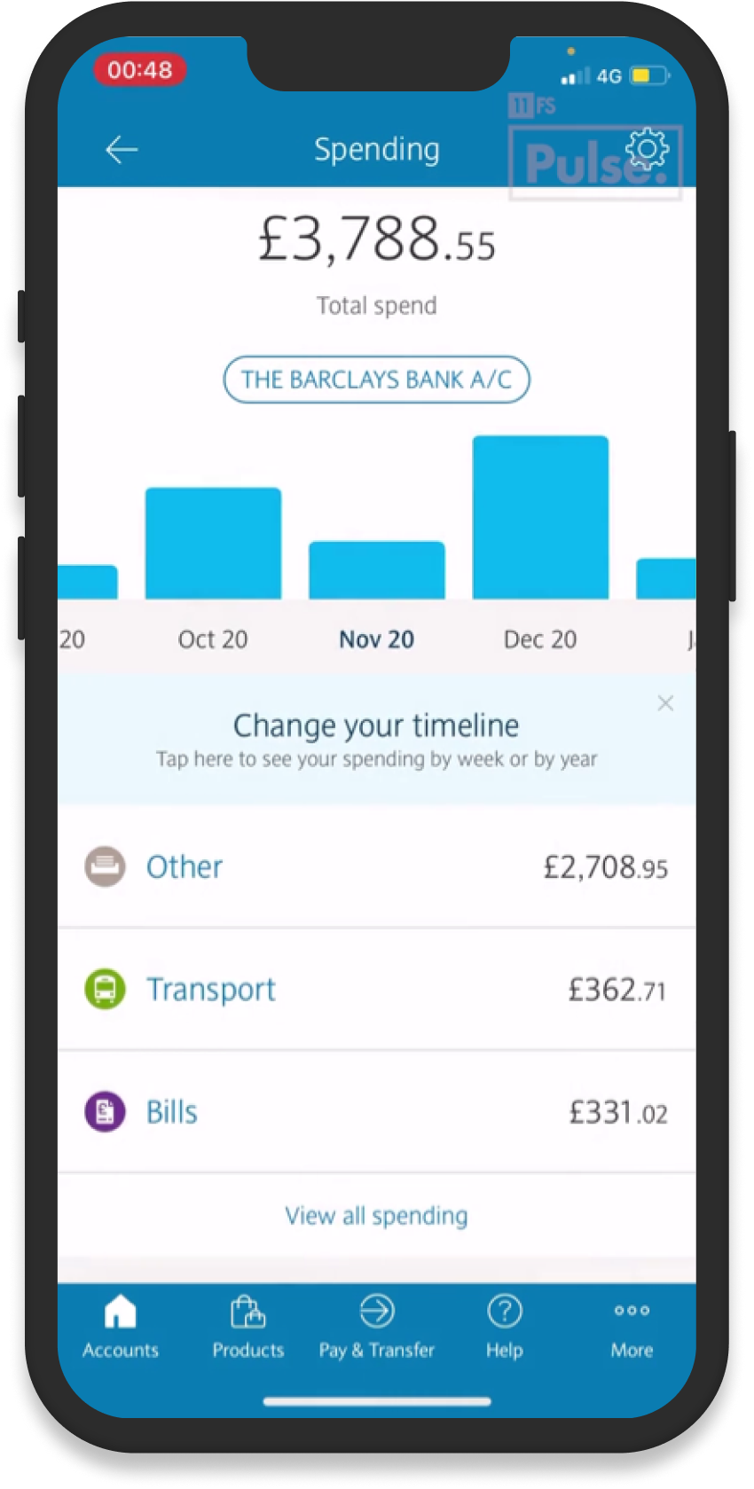
Concept & Wireframing
The dashboard
Once we clarified our goals and defined what could be achieved in this initial phase, we moved on to concept development.
This process involved generating a wide range of ideas and sketches, exploring different methods of presenting the data through infographics and experimenting with various approaches to hierarchy.

First design & user testing
First iteration

We incorporated first direct’s newly introduced illustrations to bring the section to life, pairing them with bold colours and signature typography to maximise visual engagement. This approach allowed us to present content in a way that was both impactful and easy to digest.
We conducted over 10 hours of lab-based user testing with a diverse group of participants to gain deeper insights into all aspects of the dashboard’s functionality and usability.
User testing & further ideation

Findings
The feedback was predominantly positive, with common themes emerging around areas for improvement. This input was crucial for guiding the next steps and iterating on the designs effectively.
☹️
☹️
Key Painpoints
The hub needs to clarify its purpose, highlight the other available features, and improve to help users easily identify entry points to more detailed areas.
👍
👍
Customer preferences
The visual cues and use of color helped users section different areas of the dashboard, and they responded positively to the quick overview of their financial position.
Further ideation & final design
Finished designs
After multiple rounds of testing and incorporating the insights gained, we finalised our design.


The Insights Hub project provided invaluable lessons in user engagement and data-driven design. One of the key challenges was understanding which data points users would find most relevant and how to present them effectively.
Our approach showed that simplifying complex data into visual, easy-to-understand insights not only boosts engagement but also strengthens the connection between users and the app. Users valued the practical aspect of tracking their financial habits, but they were equally drawn to the feature’s visually appealing design.
Ultimately, this project reinforced the importance of understanding user needs and motivations in creating tools that empower individuals to take control of their finances. Moving forward, these insights will guide us in designing even more meaningful features that truly resonate with our audience.